Hopping on the "Wrapped" Trend
I created a personalized "Wrapped" presentation to celebrate my husband's 30th birthday — here's how I designed it and what made it special.
One of the great joys and struggles of being on Instagram in December is seeing everyone’s personalized “Spotify Wrapped,” summing up their year of music/podcast listening with fun designs and silly statistics.
As a huge design and data nerd, I LOVE viewing my “wrapped” for my various apps (BeReal, PocketCasts, and Apple Music to name a few), and observing everyone else’s online. How many friends do I have in the top 5% of Taylor Swift Listeners?
Aside from the summaries that I view on my own applications, there has been a recent trend of people on TikTok who create their own take on the “wrapped” trend, by quantifying their year in dates or even crying sessions. I have loved watching people get so creative with their data collection and presentation that I desperately wanted to create my own!
My wonderful husband was born in December of 1993, and that’s when it hit me: He is turning THIRTY and I have known him since he was twenty years old, so I could wrap up his twenties! Both a meaningful gift for him and a fun project for myself :)
The Process
I first needed to decide how I wanted to present this information to him. I considered creating a mobile site for him to scroll, but then decided I wanted to present this at his birthday party with our friends, so it needed to be in a shareable format. I decided on a landscape presentation that I could cast to my Apple TV.
I decided I wanted to go for a retro, fun, maximalist vibe. I don’t actually have Spotify, but I wanted it to feel like a Spotify Wrapped (from how I remembered it in 2018).
The hardest part was thinking about the animations. I feel like the animations are what really make these presentations appear to be more professional. I have yet to learn any animation software, so I decided to go with Canva to create my presentation. Canva has a feature where you can drag objects on the screen to create your own movement of animations, and I felt like this would be the best tool at my disposal to accomplish my goal.
I decided on the categories by thinking about things that I knew about Dylan, and what could be interesting to see over the course of 10 years. This is what I decided on:
- Travel
- Music
- Shows
- Major life events
- Something techy
These broad categories allowed me to think about the past 10 years and try to sum up the highlights.
The ✨Details✨
Before you watch, I just wanted to sum up some of my favorite details I incorporated into this presentation.
Words Matter
In the first slide, a bunch of words rotate through that may describe Dylan’s 20s. I chose these specific terms as they were words that became popular over the course of Dylan’s 20s.
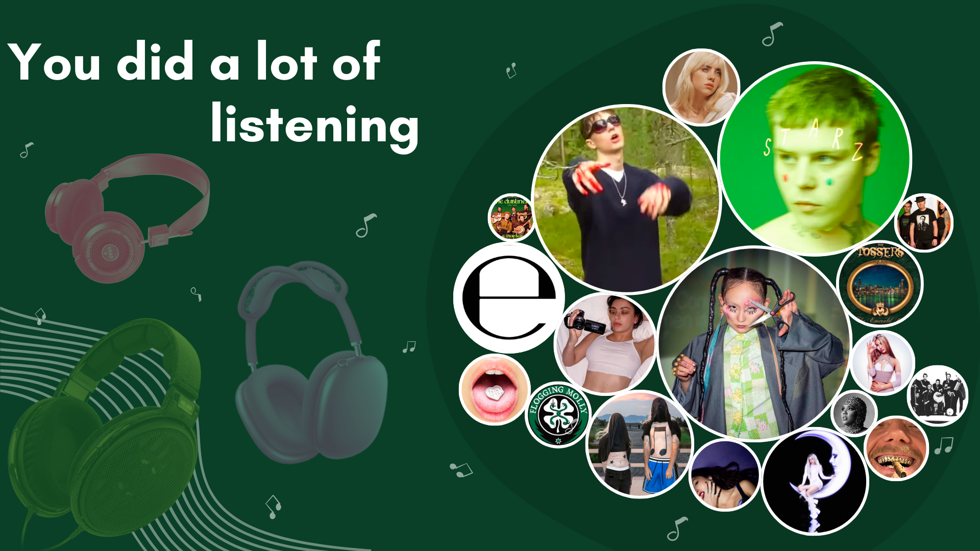
Audiophile Touch
Dylan is a huge audiophile and loves collecting headphones and listening to a broad spectrum of music. I decided to incorporate his top three most listened to pairs of headphones as well as his top artists over the years.
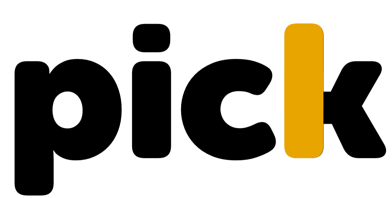
TV Time
Dylan and I watch our shows on the platform called Plex. My favorite detail from this page was redesigning the Plex logo to say “Pick,” short for Pickle, which is a nickname of his (Dill Pickle…Classic play on Dylan).
The Music
After watching through the presentation a couple of times on my own, I knew it was missing something… Music!
I decided on the song “Starships” by Nicki Minaj. This song is an iconic part of Dylan’s early twenties, being used all of the time in fun events like college orientation, school dances and events, and much more. The energy really fit the vibe I was going for.
The Final Product
Without further ado, here is the final product! This was so fun to create and I will definitely be collecting more data and designing more personal “wrapped.”
Big shoutout to the designers at major tech companies who work on these wrap ups. I really enjoy them!
What was your favorite app’s “wrapped” this year?